A Different Way to Analyze the Box Office
Normally, analysis of the domestic box office in order to discern any meaningful insight is difficult. New movies are released every week, each movie is released in a different number of theaters, and patterns of movie attendance vary from day to day, week to week, month to month, and season to season. If more people tend to go to the movies on Monday than on Tuesday, how can you possibly tell whether a particular movie is doing well on Tuesday versus Monday?
I’d like to isolate one of those issues - day-over-day comparison. Currently, sites like Box Office Mojo tend to emphasize the change in dollars spent on a particular movie from one day to the next. As a quick example: the percentage under the dollar amount represents the change in dollars spent on each movie from one day to the next.
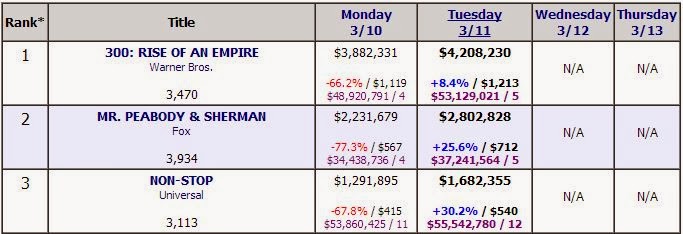
Well, that’s not particularly meaningful when you’re comparing Sunday to Monday - more people will always go to movies on the (Friday, Saturday, Sunday) weekend than on a weekday, hence the 70% drop for these movies.
Here’s another way to think about it - given that a certain amount of money is spent on movies in domestic theaters on any given day, what percentage does a particular movie represent, and how does that percentage change? Sure, Non- Stop made $1.3 million on Monday and $1.7 million on Tuesday, but did it really do any better on Tuesday? Aren’t there just more people going to the movies on Tuesday?
Put it this way - what’s harder to analyze: the first chart or the second chart?
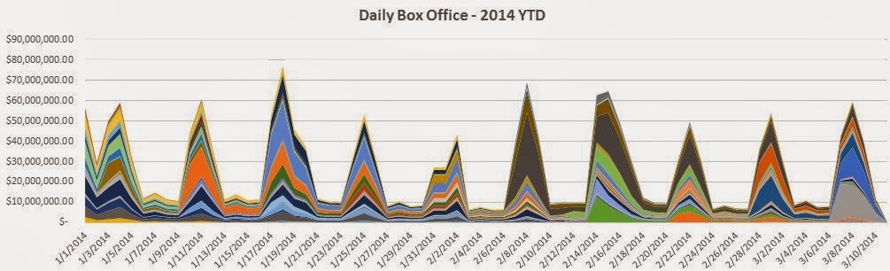

I didn’t include the movie names on purpose. Not only would it be extremely difficult to visually match each to a color, but also, what I’d like to get across with this post is that it is easier to view trends using the second chart. For example, the dark gray area represents The Lego Movie. In the first chart, it’s very difficult to see how it performed over time. In the second, by removing the effect of the fluctuations of overall box office revenue, trends are much easier to spot. The Lego Movie continued to hold a strong percentage of total box office receipts even as it was making fewer dollars.
This is a very contained time period, from which it is hard to draw any insightful conclusions - this is simply a different way to look at the box office. But I will continue to incorporate more data, and hopefully interactive visualizations, that make it easier to spot trends over time - not only on a movie by movie basis, but by genre, rating, gender of the lead character, length of the movie, time period in which a movie is set, and any other category that could be applied to films.
(All box office data is from Box Office Mojo.)
(Sidenote: This may seem similar to a very cool visualization the New York Times put together a few years ago. I suggest you check it out - it’s fun to play around with - but it’s not quite what I have in mind for analyzing the data.)